Today’s shoppers are becoming more and more like the hero of The Truman Show. Every day, they are being watched by a whole army of marketers who study their buying behaviors, trying to come up with ever more cunning and sophisticated selling techniques.
Liked Video presents you with a list of some of the most clever traps that salespeople use to ensnare shoppers.
Keep your comments coming — we’d love to hear about your personal ways of avoiding stocking up on useless stuff at the supermarket!
10. Misleading visual appearances
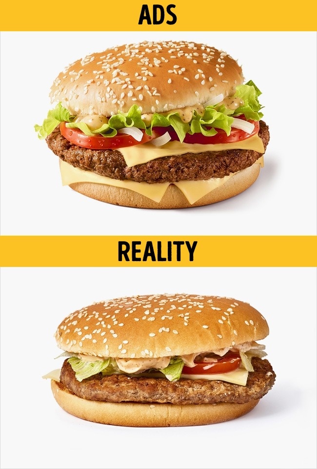
To emphasize the freshness of products and make items like hamburgers look more appetizing and appealing, food photographers sprinkle water on their surface. This technique is also successfully used by sellers of vegetables and greens. The mouth-watering results promptly tempt us into making unplanned purchases.
9. Anti-advertising slogans
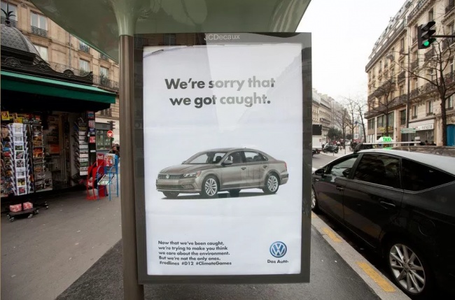
«We’re sorry, but we can’t sell you this.» That’s roughly the underlying message of some of Volkswagen’s slogans. Has this approach actually stopped someone from buying their cars? On the contrary: more attention means higher sales!
8. Overpricing
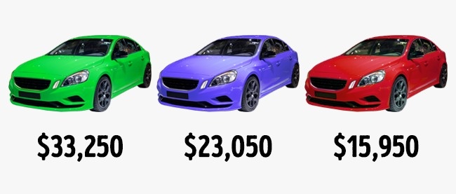
This clever ploy proves effective with nearly every customer. It works like this: the most expensive goods are displayed first, while the less expensive ones bring up the rear. However, although these items cost less in comparison, they are still significantly overpriced. This tactic is successfully used in restaurants. A bottle of the same brand of mineral water costs a different amount in a supermarket, in a railway station cafe, and in a restaurant. People tend to see restaurants as more reliable in terms of quality, so restaurant prices are likely to be 2-3 times higher. This in no way deters customers and even serves as a status symbol.
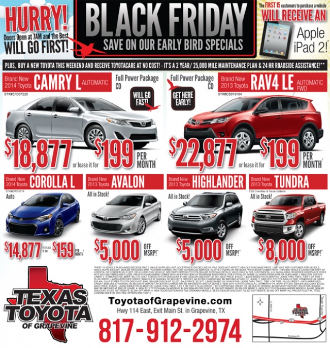
7. Decoy pricing
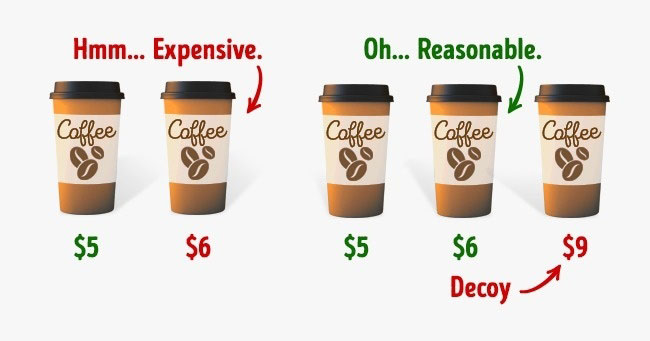
Expensiveness is a relative notion. A decoy-priced product works by making other products look reasonably priced in comparison. This effectively forces the customer to make the «right» decision.
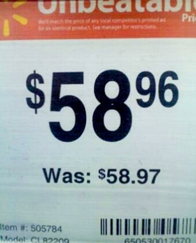
In stores, we often see price tags with the old price crossed out and the new price written in large digits. But few people realize that, more often than not, such price reductions are completely phony. In reality, shop assistants simply “inflate“ the old price by 20%, hoping that no one will remember the original price for that product. Another example of false discounts is when we are offered, say, a coffee and cake for a ”special offer» of $10. It doesn’t matter that each of the products individually costs $5 — subconsciously we still perceive this as a nice bargain.
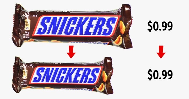
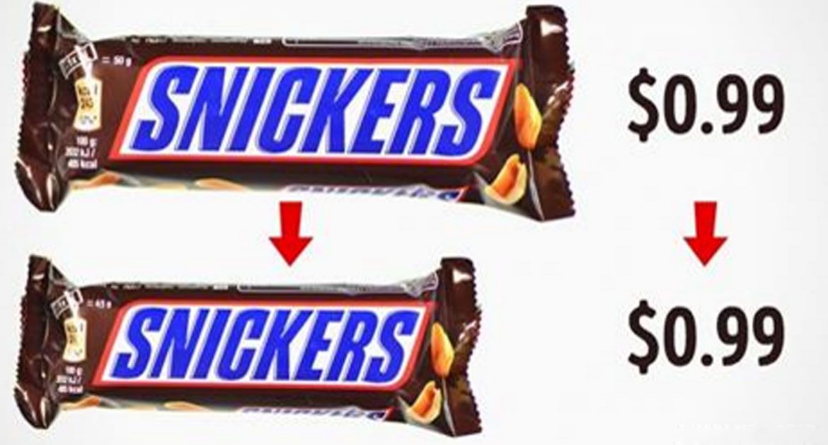
A favorite with big brand producers and supermarkets, this ploy allows them to maintain a stable profit rate without raising prices.
4. The Gruen Effect
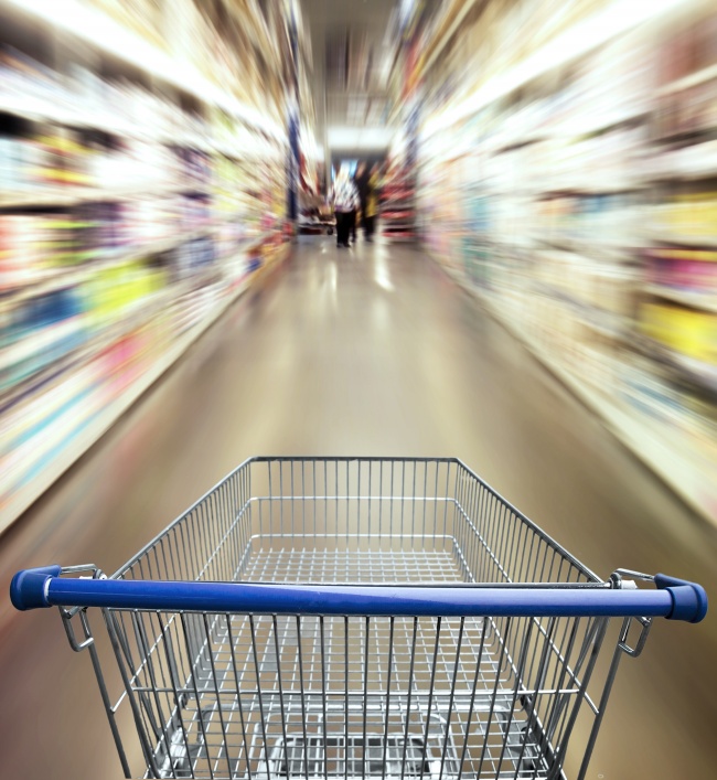
The world’s first fully enclosed shopping mall was designed by the architect Victor Gruen. Before Gruen, shopping malls consisted of detached single-storey buildings, linked together by walkways. The architect managed to unite a multitude of shops under a single roof, creating a mazelike supermarket. The Gruen concept entails a perfectly safe world that is always warm, well lit, and comfortable. A place without windows or clocks. Nowadays, nearly all shopping malls are built in this fashion. Such an environment causes people to fall into a state of disorientation and light trance, making them forget about the real purpose of their visit. Walking around a large shopping center, we seem to lose our ability to make sound decisions. As a result, we’re likely to make impulse purchases and spend more than we originally planned.
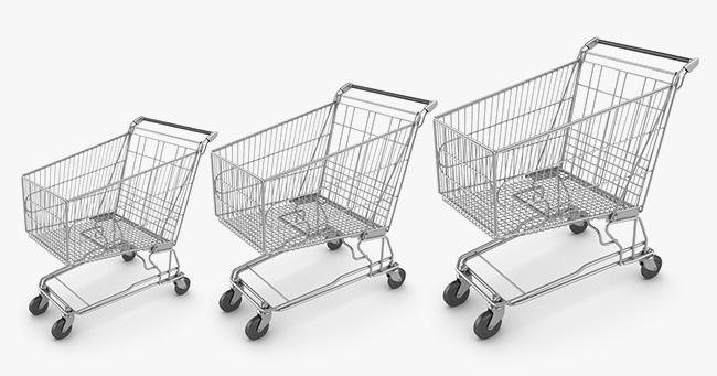
When customers use shopping carts instead of baskets, they’re likely to spend up to 40% more, though not in the case when they’re making purchases to meet the needs of a large family or to stock up on food for a week. The supermarket personnel intentionally position food essentials (products like bread and milk) at the far end of the hall, or even at its opposite end. This is the best way to make sure that customers pick up a few additional (and, ultimately, redundant) items along the way. In many supermarkets, the aisles lead in a counterclockwise direction — this also provokes people into making unplanned purchases.
2. Anthropomorphism
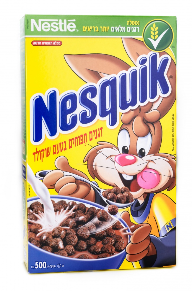
Anthropomorphism means our tendency to invest in things and creatures with human qualities. This includes arguing with computers when they don’t work properly, giving affectionate names to cars, and talking to animals as if they were people. Animated movies like Cars and Minions and Pixar’s famous table lamp character are good examples of anthropomorphism. When companies use animal mascots as part of their brand’s promotion and packaging design, consumers tend to empathize with the characters, thus becoming sympathetic toward the product as well. Anthropomorphism strengthens consumers’ trust in the company and its products, which, in turn, leads to an increase in sales.
1. Cunning layout of products
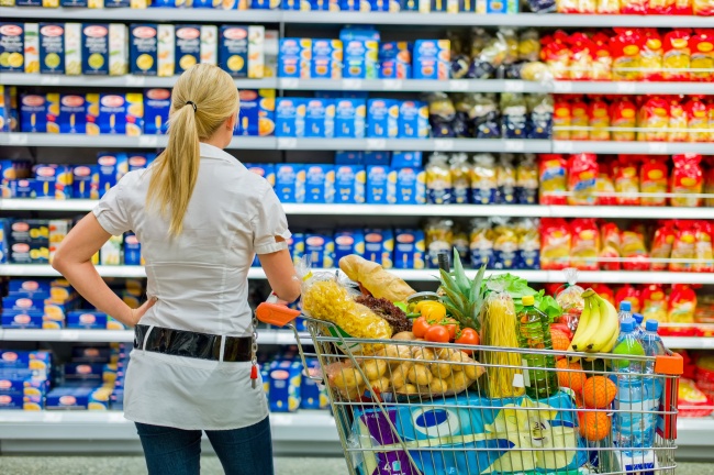
In any supermarket, the top shelves are reserved for the less well-known brands; the middle shelves (aka the “Golden shelves“) for the popular, hyper-advertised trademarks; while the bottom shelves house the produce of virtually unknown companies and children-oriented products. To rent the ”Golden shelves» costs companies a lot of money, which naturally affects the price we pay for their goods. If you wish to avoid getting caught on this hook, always follow a simple rule: before you pick up the goods from the middle shelf, compare their price and quality to that of the goods located on the upper and lower shelves.
Good luck to you, and happy purchasing!
