Team Clark is adamant that we will never write content influenced by or paid for by an advertiser. To support our work, we do make money from some links to companies and deals on our site. Learn more about our guarantee here.
If you’re searching for a new job, an excellent resume is crucial to landing an interview with a hiring manager. But how exactly should your resume look in 2018?
You can stop searching Google for “best resume advice” because Clark.com has everything you need to know!
Clark’s guide to a perfect resume in 2018
We reached out to Laurie Berenson, professional resume writer and founder of Sterling Career Concepts, to provide us with sample “before” and “after” resumes.
Following the same techniques that Berenson uses with her clients can help your resume end up in the “yes” pile.
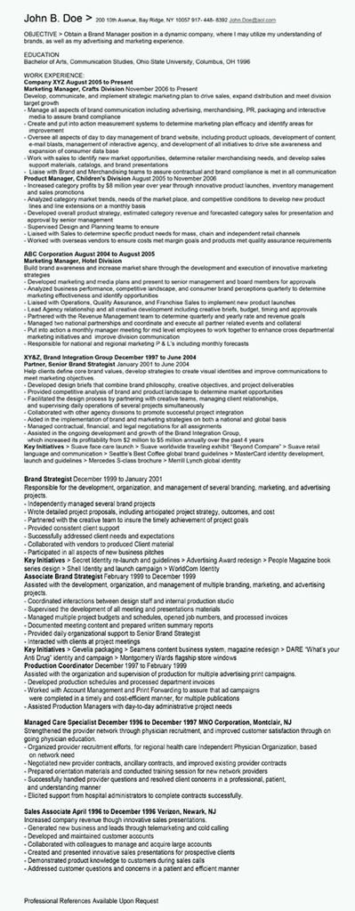
Let’s get started by taking a look at the “before” resume for John B. Doe. Many hiring managers spend less than 10 seconds reviewing a single resume, so you must be able to grab their attention — but this resume doesn’t do that.
You can have all the experience in the world, but a resume that’s not easily readable and skimmable will get you nowhere.
“Before” resume

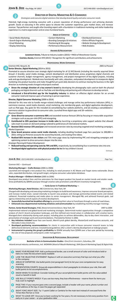
Berenson gave our sample resume a complete makeover. The end result is a modern, professional resume that makes a good first impression in the top half of the first page.
“After” resume

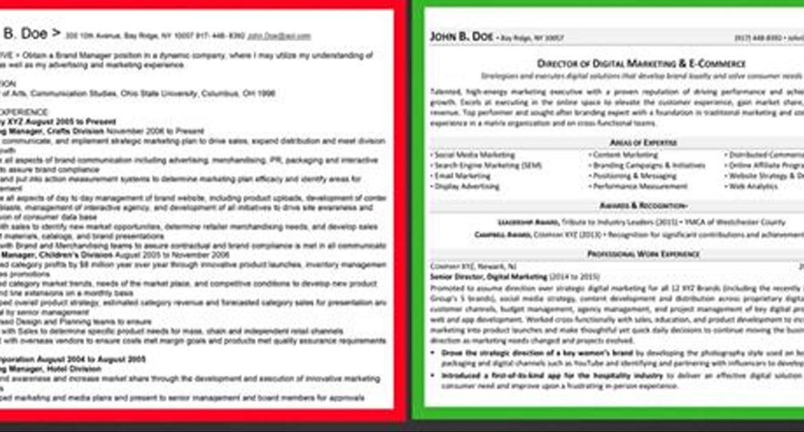
Does your resume look more like the “before” picture than the “after?” Berenson’s secrets to resume success will help you craft a resume that will get you hired. Here are her top tips:
9 keys to make your resume stand out in 2018
1. Make it pop
Don’t rely on Microsoft Word templates. Create a custom resume with a professional border, incorporate a small amount of color and don’t be afraid of bold or italics. Avoid going too small on the font and use white space strategically.
2. Lose the objective statement
Objective statements focus on what you’re looking for, but companies frankly don’t care about that. Replace the objective statement with a brief executive summary that lays out the value you offer to an employer.
3. Areas of expertise
The areas of expertise section is a list of keywords that highlight your specific skills and knowledge. Your core competencies should be customized to match the skills mentioned in a job description. Put the most important keywords in the first column on the left and at the top of each column reading across.

4. Presentation counts
Make the work experience section shine by leading with the most valuable thing you bring to the table. For easy reading, avoid long paragraphs and run-on sentences. A good rule of thumb is to group your responsibilities in short paragraphs to introduce your role and add bullet points to list your accomplishments.
5. Know when to go bold
Using bold can help your accomplishments pop off the page and/or differentiate between job entries. Consider kicking off your accomplishment bullet points with the value-added result or benefit in bold. Notice how these examples from our sample resume all use strong and compelling action verbs:
- Grew direct-to-consumer e-commerce 90% and exceeded revenue forecast 28% by focusing on measurable acquisition strategies such as pay-per-click (PPC) and retargeting.
- Contributed to 20% year/year increase in inside sales by launching a proprietary sales support website that allowed sales team to create on-demand catalogs tailored to preferences of international markets.
- Boosted 2012 revenue 15% year/year and increased conversion rates by executing targeted email marketing campaigns.
6. Use bullet points wisely
One common resume mistake is using too many bullet points! If your work experience section is simply a list of bullet points, they lose effectiveness because the reader’s eyes glaze right over them. Reserve bullet points for items you truly want to highlight.
7. Page two
A one-page resume is generally sufficient for a young professional, but a two-pager is preferred for more experienced job applicants. If your resume goes onto a second page, include a header with your name, phone number and email address in case the pages get separated. You may also include your LinkedIn profile address in the header if your profile is updated.
8. Right font, right size
Steer clear of overused fonts like Times New Roman and Arial, and instead try Calibri or Cambria. As for font size, 10.5 or 11-point is usually the way to go.

9. What to leave off your resume
Did you notice that our revised sample resume omits John B. Doe’s street address? Many applicants are only listing their city, state and ZIP code due to concerns about identity theft — and that’s OK.
Something else to exclude is the “Professional References Available Upon Request” line at the bottom. That’s obvious!
Also, once you’ve been working for more than five years, it’s not necessary to list every position from early on in your career — or even your graduation date — unless it’s relevant.
By the way, recent grads are advised to only include their GPA if it’s 3.5 or higher.
Final thought
If you haven’t looked at your resume in more than a year, Berenson told Clark.com that it’s a good idea to dust it off and update it so that you’re ready when the perfect job opportunity comes along.
When you’re done with it, have a family member or friend look it over to check grammar, tense and spelling.
Overwhelmed by all of this? A job seeker may want to consider working with a resume expert if they struggle to write about themselves or if they’re not getting called for interviews.
To help you with the writing process, click here for a printable version of Berenson’s sample resume and advice.


